Map clustering gives your map more meaning

One of the hazards of making web maps is marker overload. That’s when you have so many points in a small area that they start to overlap and lose their ability to tell a useful story. BatchGeo has several features to not only alleviate the disorder, but also make more sense of the data in your map.
The solution may seem obvious: show fewer markers on the map. But wouldn’t you lose data that way? Nope, it turns out we can actually expose more of your data and give your map even more meaning.
Our map clustering algorithm looks for markers that are near each other and replaces them with another icon to represent multiple markers. That icon will be labeled by default with the number of markers it contains, but can optionally be used to show the average or sum of specific data. On top of that, if you use marker grouping, the category color of the markers will be represented in a pie chart for each cluster.
Basic map clustering
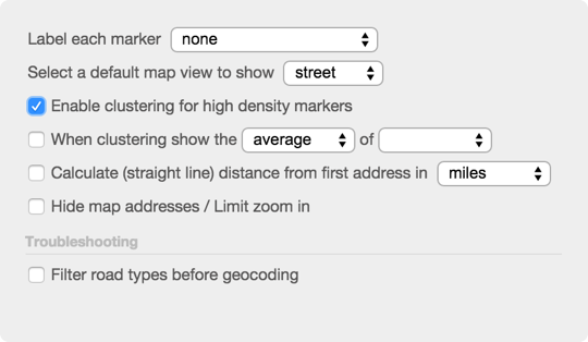
Clustering is automatically enabled on your maps with 300 or more locations. You can adjust the setting under advanced options when either creating or editing your map. A basic clustered map displays the number of markers it represents. The larger that number, the greater the diameter of the circle representing the cluster.
As you zoom in and out of your clustered map, BatchGeo re-calibrates the number of markers we can display. If you click a cluster, we automatically zoom in and show individual markers (if possible) or sub-clusters.
If your map is grouped by additional data in your spreadsheet, we take that into account when displaying clusters. You will only see the data you select, and the groups present within the cluster are shown as a pie chart.
The basic map clustering is useful for making sense of dense markers, but the average and sum options bring even more insights to the forefront.
Show the average of clustered values
When clustering is enabled on your map, you’ll get a secondary option to show the average of specific data within the marker. For example, suppose we have the median income for every county in the United States. That’s over 3,000 data points to fit on a map, which makes it a perfect candidate for clustering.
- In advanced options, check “enable clustering for high density markers"
- Then check "when clustering show the average of" and select the field to show.
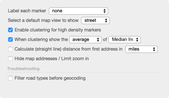
Now your map will replace densely packed markers with clusters whose label is the average of the field chosen. You may find this useful for:
- Real estate: show the average sale price of homes
- Journalism: show the average health score of restaurants
- Sales: show the average deal size by region
If you have a lot of data, clustering can cut down on the visual clutter and increase the information exposed in your map.
Show the sum of clustered values
View 2015 UFO Sightings, sum clustering in a full screen map
Sometimes you don’t want to know the number of markers, nor the average of values, but instead count up the values within a particular cluster. The approach is almost identical:
- In advanced options, check “enable clustering for high density markers"
- Then check “when clustering show the” and select “sum” from the drop down
- Then select the field to count up
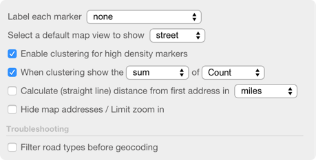
Now your map will label each cluster with the sum of the field chosen. You may use the sum option for:
- Sales: show the total value of deals in a region
- Journalism: show the total number of crimes by neighborhood
- Retail: show the total items shelved in an area
BatchGeo’s clustering technology helps you make more than a map, it releases the meaning within your data.